
Monneo
Founded: 2018
Headquartered: London
Customers (not disclosed): Up 80% in 2020/2021
Background:
Monneo is a UK-based payment provider which connects online merchants to a network of EU and international banks to provide virtual bank account numbers and banking services. The solution is built around the open banking protocol.
The challenge
Due to Monneo’s solution being specific to the ecommerce industry, Monneo was struggling to find unified messaging that would explain the details of its solution to both its customers, ecommerce merchants, and its partners, the traditional banks.
“We knew what we wanted to achieve, our goals and where we wanted to be,” explains MD Lili Metodieva. “We had to fill this gap and determine what additional tools and activities we needed as part of our strategy to ensure we communicated the solution properly in the right way.”
The company decided to develop a brand that would make the company stand out in the “saturated” fintech world, as well as one that customers, partners and employees would be happy to be associated with.
From visual to spiritual identity
“I wouldn’t say we had everything planned from the beginning, but with every step of the process there were more and more things to improve. Looking back it looked like an iceberg, where we were only able to see part of what we had to achieve.”
The rebrand started with the name, moving from its undisclosed former name, which was “a regular corporate name, not catchy, which didn’t speak about services in a proper way”. The team chose Monneo, meaning new money, which aligned with the goal of embodying innovation.
From there the firm moved onto updating the brand visually to modernise it. However, at this stage Lili says it became apparent that the brand refresh had to be about more than look and feel.
“We had to define our brand DNA: our functional, societal and spiritual mission.”
Defining this meant asking a lot of questions until the team was able to define all aspects of what Monneo stood for.
The new brand
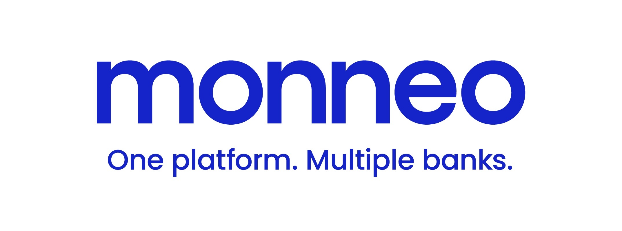
The details of the new brand are laid out in a 45-page internal document. Visually, the company opted for a clear lower-case logo with the tagline “One platform, Multiple banks” and a palette of colours including blue, purple, green and navy.
Monneo’s brand guidelines also include a range of “values”, under functional, emotional, societal and spiritual headings, while language has to be assured, passionate, concise and guiding. The document includes examples of how to communicate and summaries of the key messages for both audiences.
With the rebrand completed, the team involved worked to educate the rest of the company so that the thinking behind it was clear to everyone.
Challenges and learnings
There were numerous complexities to consider: for example, the previous website had a good Google ranking, while corporate stationery and the layout of documents had to be changed in quite a short period.
Lacking the inhouse resources to handle all of these challenges, Monneo opted to outsource most aspects of the rebrand such as design, PR and SEO. Finding partners which the team clicked with was difficult, but Monneo managed to find the right agencies through industry peer recommendations.
Lili says this experience with partners was one of the key learnings from the rebrand.
“If you want to do things right, you have to find the right professionals and experts, not just anyone. You have to find those professionals who work on the same frequency as you and who think in a similar way. Then things work like a charm.”
Another challenge was finding a middle ground which would communicate to both of the groups Monneo has to communicate with: clients and partners.
“They’re completely different – it’s very hard to find an approach that would fit both groups.”
Lili says this middle ground came from focusing on the issues of trustworthiness and the firm’s core values. The conversation started with three or four different concepts, which evolved through the same question-asking approach until the right direction and concept was found to merge the two groups.
Finally, a third challenge was to educate staff in the brand and how to pay attention to the details.
“This requires an ongoing education,” Lili says, as the language used in client conversations is also an important part of the rebrand.
“It helped that employees quite enjoyed the new brand.”
Outcomes and KPIs
While Monneo didn’t set any formal KPIs for the project, Lili says the rebrand has received “very positive feedback”, including at the first post-pandemic industry event the company attended in early July. Meanwhile, certain parameters around website performance have remained stable and even improved in some cases.
“Our focus is very much on innovation in the fintech and payments space,” says Lili. “We will keep on working on adding more banking partners and continue to address challenges in the payments industry.”
Continue reading this article
Continue reading this article
Register for free todayor
To get access to all of our premium content, please click below to view package options